Candid News
Candid News is a daily news service that publishes philanthropy-related articles in a digest form. In addition to news, Candid News also publishes RFP (Request for Proposals) listings and features job openings in the social sector.
It had been years since we last made any major updates to the site. Armed with our newly developed News API and input from users, we were ready to improve Candid News with more robust content and a better user experience.
Candid (In-house)
UI/UX, Visual Designer
August 2021
Our UX researcher Devon ran a survey on Candid News website asking what type of content our users are looking for. We learned that users value content that’s relevant to their geographic locations and cause areas (the type of nonprofit work they do).
Currently the content filters on our news, RFPs, and jobs pages are inconsistent, with the location filter missing from news and RFPs pages. So the obvious improvement was to add a location filter to all three pages. In addition, users need to reapply the filters each time they visit a page. The repetitive work causes friction. To motivate users to come back for more, we needed to automate the experience by implementing personalization throughout the site and adding a content dashboard.
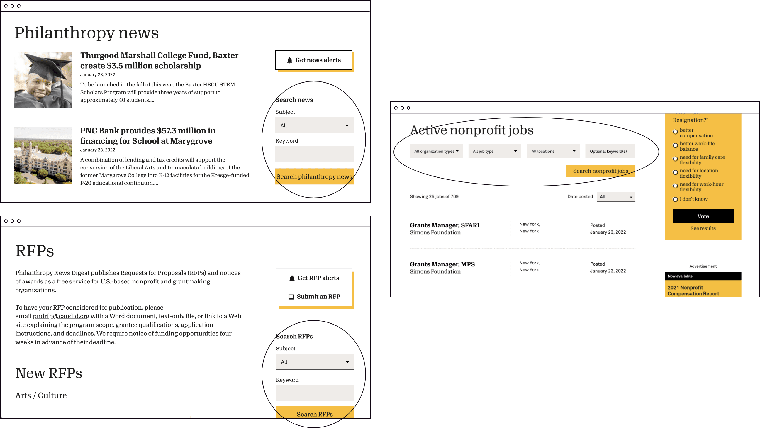
Screenshots of news, RFPs, and jobs pages from old site.
Opportunity 2 — more robust and diverse content
I started with research on best practices and familiar patterns on registration, onboarding, third party news, personalization, and dashboard design.
I started with research on best practices and familiar patterns on registration, onboarding, third party news, personalization, and dashboard design. I studied over 20 websites; those included news sites, news aggregators, publication sites, among other online services.

Screenshots of websites I researched.
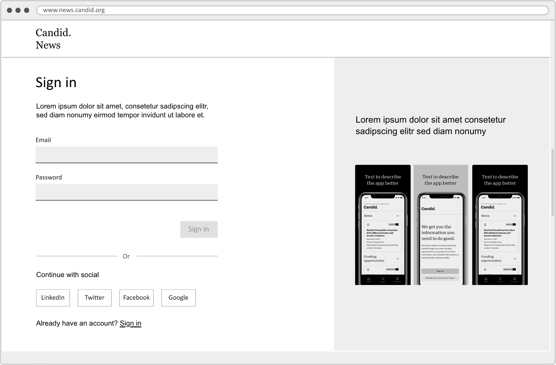
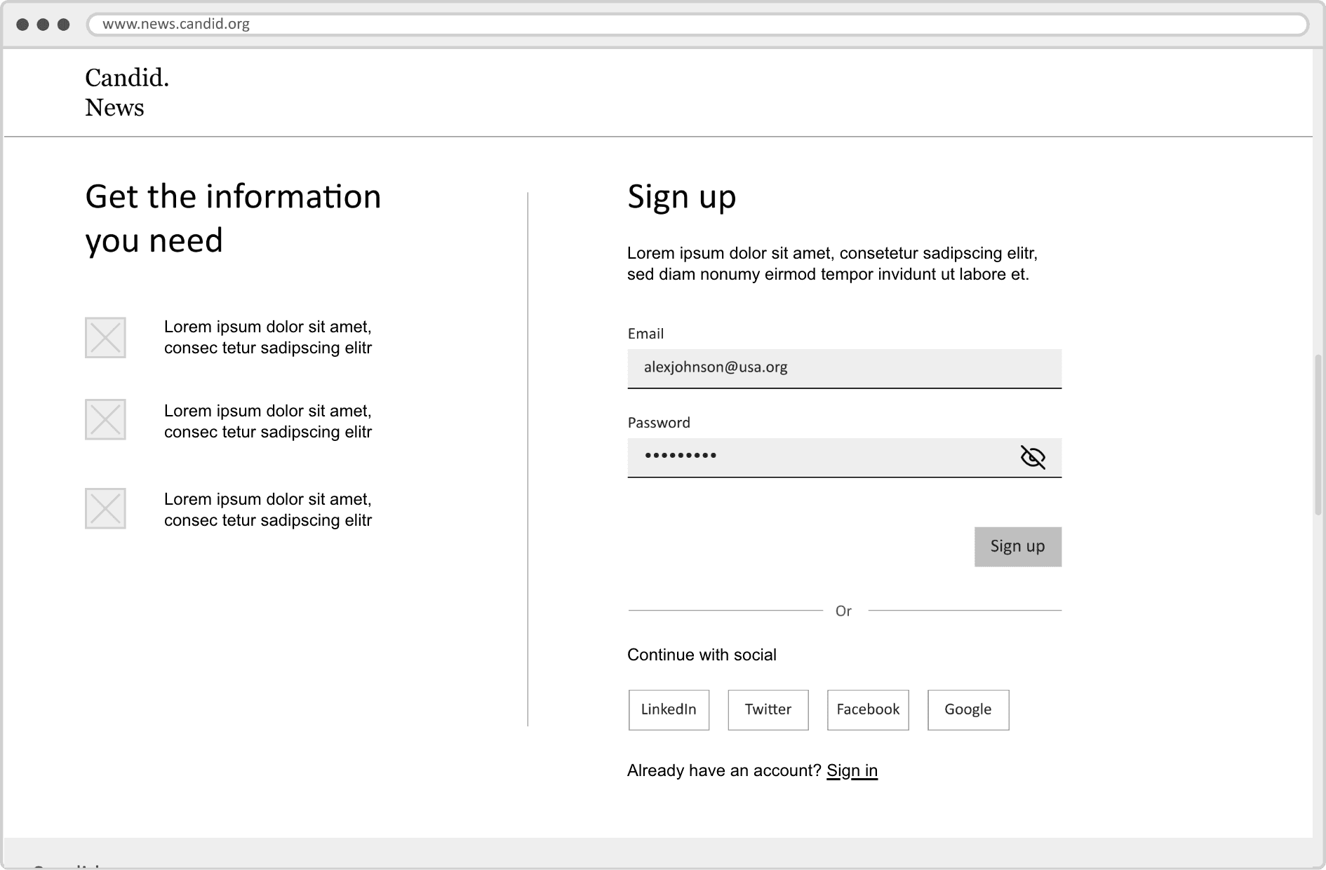
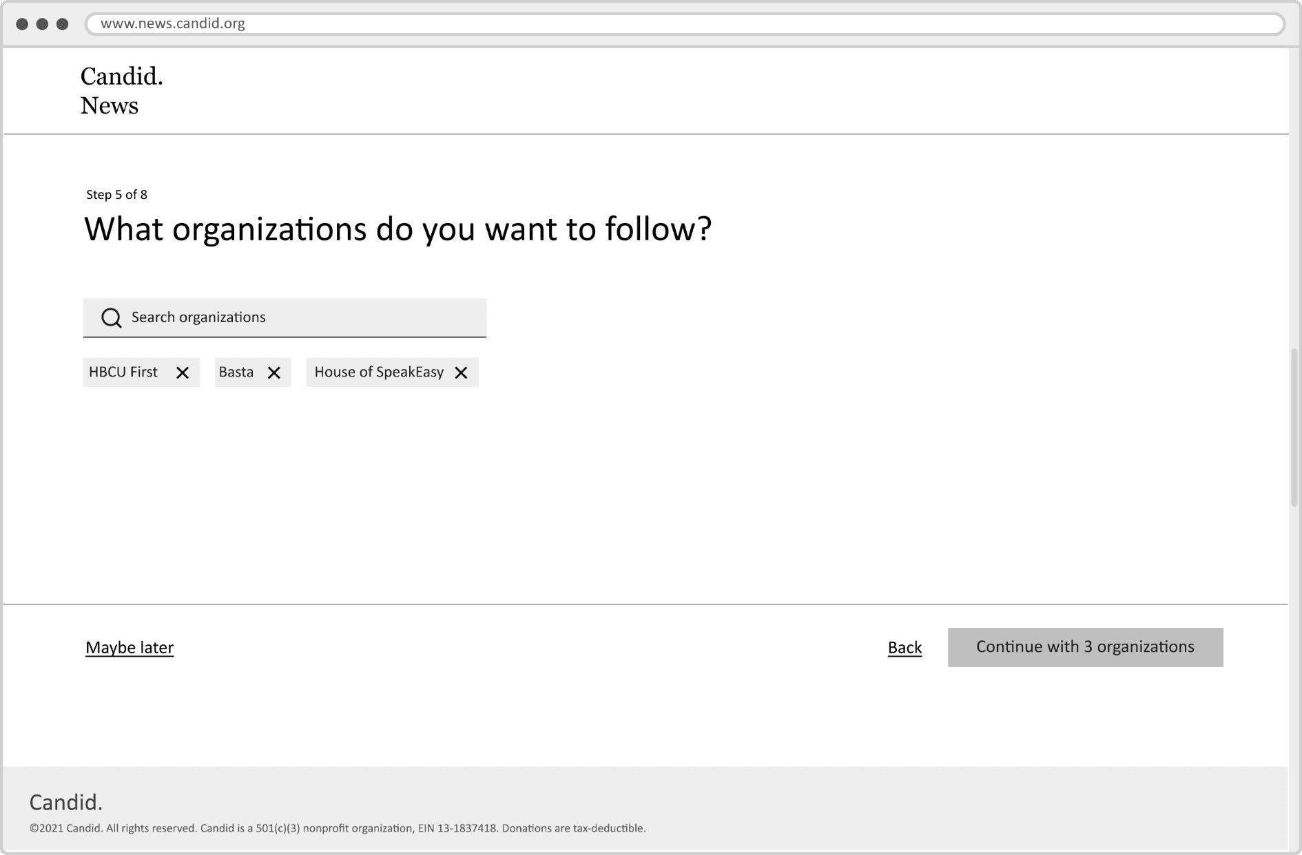
To introduce personalization, we needed an onboarding experience. I created user flows to think through the experience. The process needed to be easy so that users get through it and reach the dashboard quickly.


Next, I created wireframes in Figma to work out the details before moving on to the visual design as wires are quicker to iterate. For stakeholders to better understand how the site would look and work, these wires are pretty high-fidelity, which means they closely resemble how the final UI design would look like.

I finalized the UI using Candid’s established visual identity, which features a limited color palette, asymmetrical layout, and generous whitespace. Since the visuals are minimal, I created playful illustrations to add visual interest where they can supplement the content. For example, on the subject areas screen, the illustrations help differentiate the 18 categories at a glance.


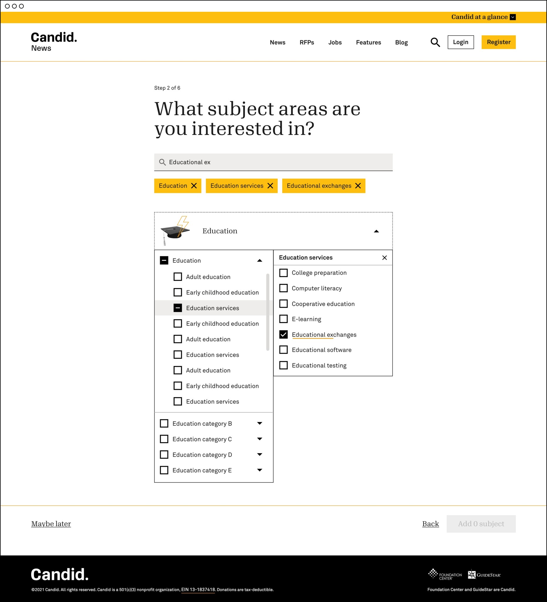
Example finished UI: login, complete profile, search subject areas (before & after search input)
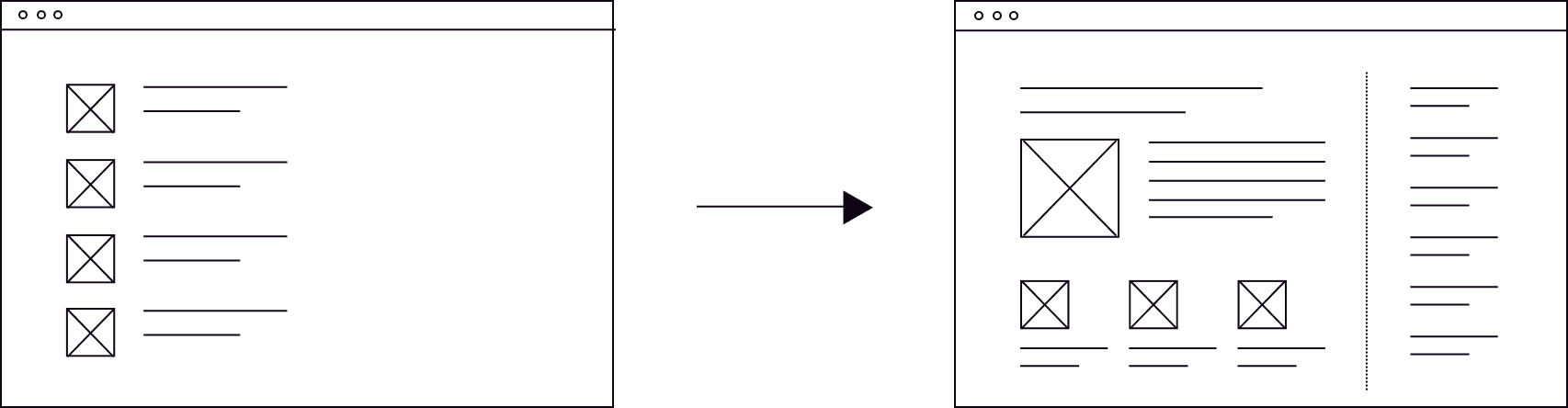
The main functionality of the dashboard is to display daily updated content. Users can filter content by type, search updates, share or save with one click. Since the cards are content heavy, we maximized space by increasing the dashboard width from 1280px (what we use across sites) to 1700px. I also designed a collapsable navigation to make room for the content—the cards adjust from two columns to three when the navigation is collapsed.


Finished UI: dashboard when nav bar is collapsed and dashboard when nav bar is expanded.
Since the cards are content heavy, we maximized space by increasing the dashboard width from 1280px (what we use across sites) to 1700px. I also designed a collapsable navigation to make room for the content—the cards adjust from two columns to three when the navigation is collapsed.
Following the dashboard, the rest of the account area is kept straightforward. Users have access to saved items and their content (jobs or RFPs submitted to be published on our site). They can change their content and notification preferences, edit their profiles, and contact support.


Nav bar collapsed and expanded.

Finished UI: Preferences, Edit profile, Newsletters.
The new homepage design takes into consideration of personalization and the addition of external news. For example, an unregistered user sees a call-to-action (CTA) in the “tops links” bar to register for personalized content. A logged in user sees a “go to dashboard” button in place of the registration CTA. The logged in user also sees the “my news” tag indicating an article matches his/her content preferences.
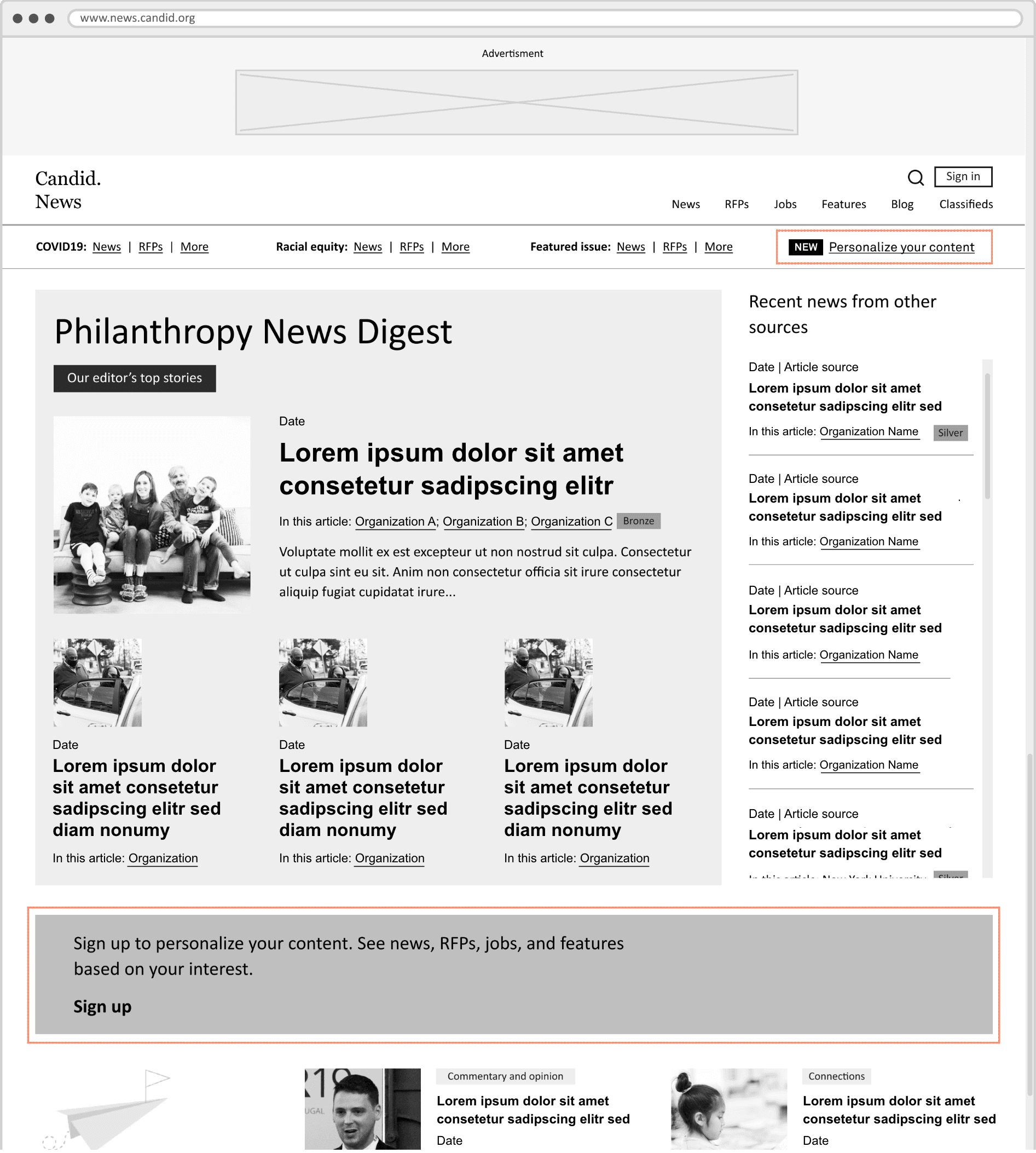
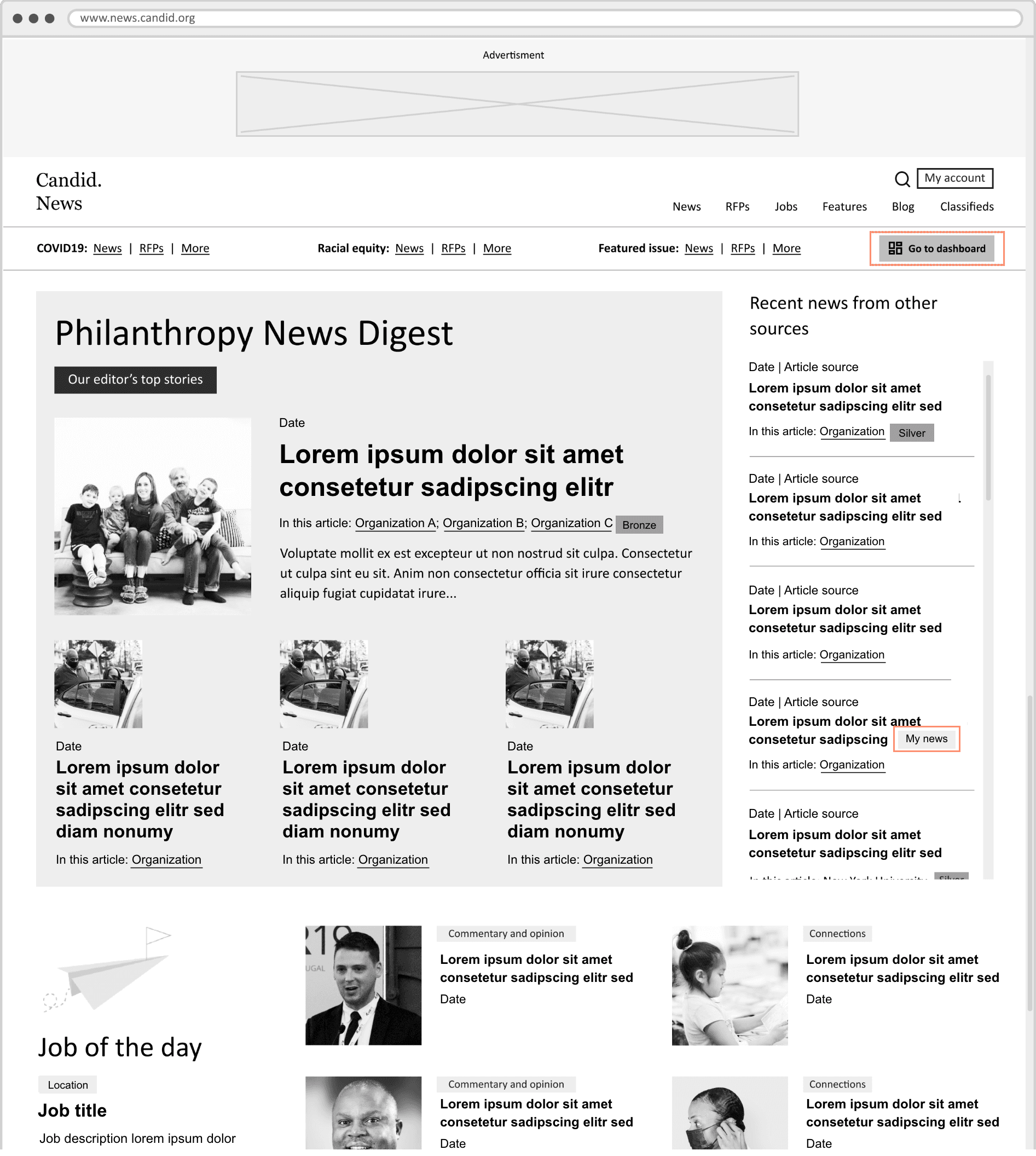
Wireframes: homepage when a user is unregistered/logged out, homepage when a user is logged in.
The news overview section takes up more vertical space than before as news is the primary offering of our site. The digests published my our internal team is prominent with the gray background and wide column. External news in contrast is less prominent with a narrow column and no thumbnail images.

Final UI: homepage before and after