Breez app
Prevent and relieve burnout for remote workers
2020 was one of the most stressful year in our professional lives due to covid. With the increase of remote work, burnout has heightened. A whopping 69% of remote workers experience burnout. There is a need to focus on nurturing employee wellbeing for better workplace resilience.
Breez is an app that offers personal recommendations for burnout prevention/relief and one-on-one sessions with psychologists. My role was primarily UX and product design, involving tasks like competitive analysis, defining product features, mapping, building user flows, creating wireframes, user testing, and interactive prototyping.
Product design
Product & UXUI designer
2 weeks


Breeze: a gentle wind; a thing that's easy to do.
The logo is a twist on the yin yang symbol — a Chinese philosophical concept that describes interconnected opposite forces. The breez logo represents the balance of work and life. And the movement inside the circle symbolizes the act of breathing into relaxation.
Final prototype
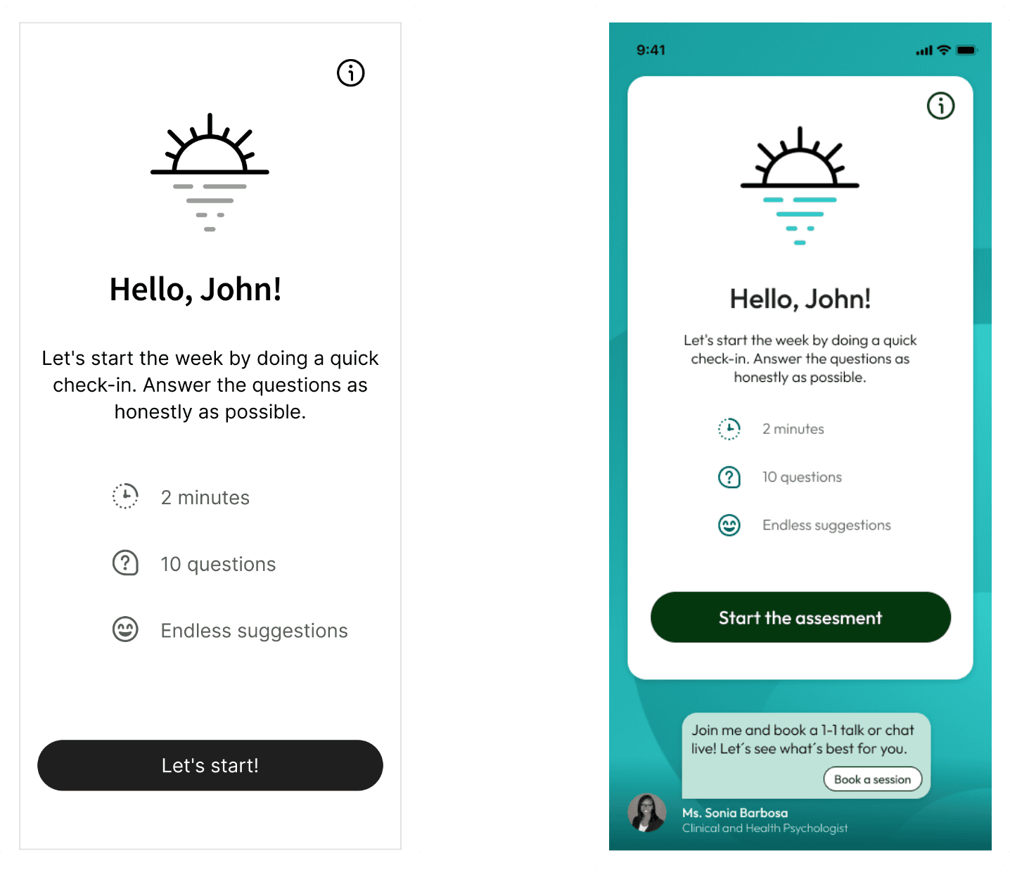
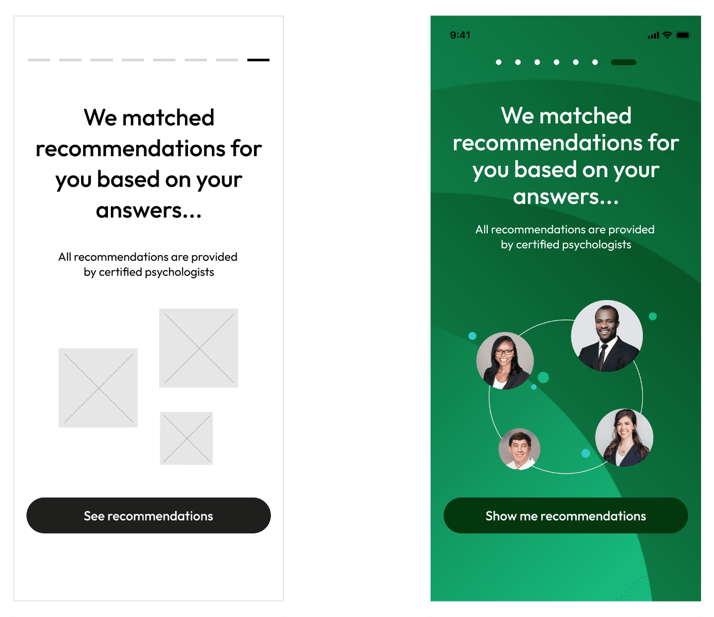
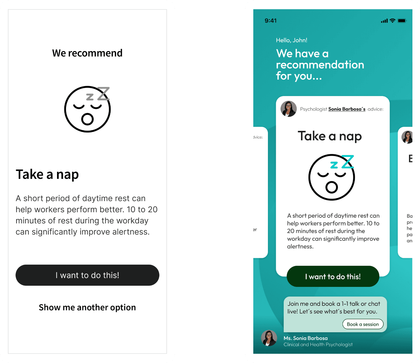
Due to the time constraint, we focused on building and testing the “golden path” for our MVP. In this flow, a new user goes through onboarding, takes the burnout assessment, views their assessment insights before receiving recommendations from psychologists. The user tries a recommendations and then evaluates the effectiveness. They also choose how frequently they would want to repeat the assessment.

Onboarding

Assessment

Insights

Recommendations
Process overview
This project was done as part of the coursework for the Integrated Product Design course during our masters studies in Interaction Design at Harbour.Space University. We followed an adaption of Google Venture’s five-day sprint process. Instead of five days, we had an eight-day sprint where we added a second round of user testing in order to iterate the prototype based on user feedback and learnings.

Research and define
Our team kicked off the design sprint process by diving into research. We identified the magnitude of remote work burnout as a problem to solve, but we wanted more context and stats to inform the project. Here are some interesting findings:
More remote jobs now compare to one year ago in 2020
Source: Ladders, Inc.
of remote employees work more hours now than in the office
Source: Indeed
of remote employees have experienced burnout
Source: Ladders, Inc.
The research gave us confidence that remote burnout is definitely a serious issue that needs to be addressed. Our solution should both prevent and relieve burnout. Following the sprint process, we started by creating the map. The purpose is to provide a roadmap for the sprint. We needed to identify key actors and a few steps that will take them to an end goal.

Now we needed to narrow down the focus for this sprint. It made sense to start with remote workers to validate the product idea. We also agreed to focus on the recommendation experience and to save the therapy for later. Once we had a clear target, we started asking questions using the How Might We (HMW) framework to reframe challenges into opportunities.

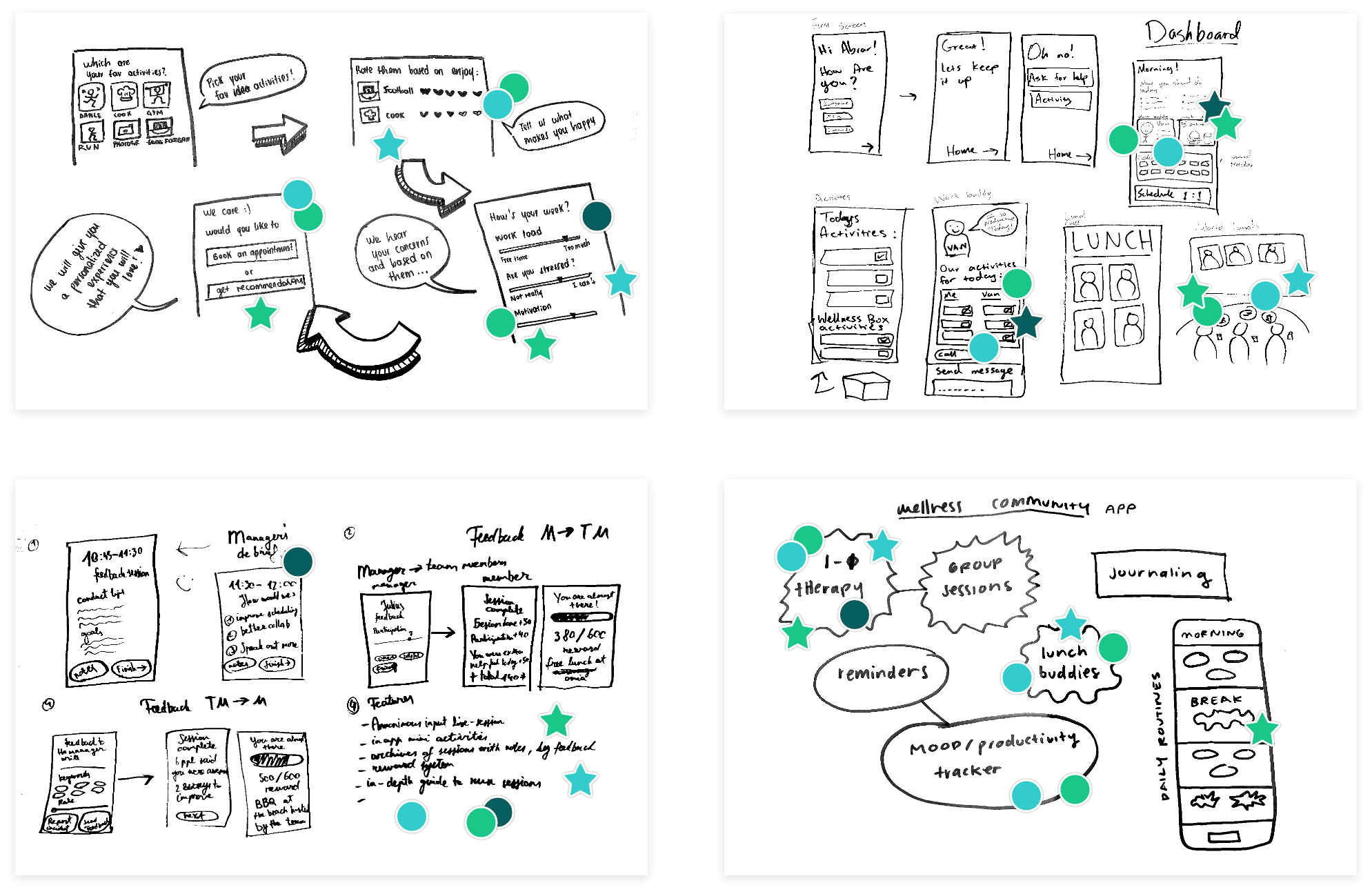
Sketch and decide product direction
Our goal on day 2 was to figure out the product direction so that we would be ready to start wire framing by day 3. We started with crazy 8s to quickly sketch out ideas. Speed and quantity were most important at this stage.

Moving from the crazy 8s, each one of us spent more time sketching a final solution that we liked most. These solutions would be more developed and inform the final product direction. We reviewed the sketches as a team and voted for product features.
Define features & key user journey
Continuing the work from day 2, we needed to prioritize product features for our design prototype since we had limited time for the sprint. To do this, we created a decision matrix. Features were ranked according to user effort and impact. That means we would prioritize features that require less effort to adapt to and generate most value for users.

From here, we started to think through the user flow that we wanted to prototype and test. This way we have a blueprint for all the screens we needed to wireframe and design. For the purpose of the sprint, we focused on the key user journey, which is the quickest way for users to find our product’s value.

Wireframe and prototype
From here, we started to think through the user flow that we wanted to prototype and test. This way we have a blueprint for all the screens we needed to wireframe and design. For the purpose of the sprint, we focused on the key user journey, which is the quickest way for users to find our product’s value.

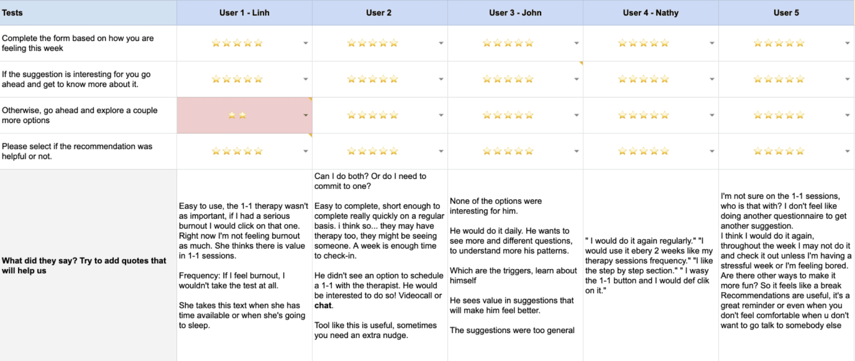
User testing
We conducted two rounds of user testing. First round was to validate our assumptions and answer internal questions which we prepared before the day of testing. We then discussed learnings as a team and decided on next steps on how to improve our prototype for the second round of testing on the last day of sprint.

We scheduled five participants for each round of testing. Each session was slotted for 30 minutes with a 30 minute break in between sessions. Participants were remote workers from different parts of the world, and they all experienced burnout. We prepared a script and structured each test session in three parts: introduction, testing the prototype with instructions from one of us, and followup questions.

During the testing, one of us would guide the participant, while another would take notes. Because the assessment would return recommendations based on either low, medium, or high level of burnout, we developed three flows based on how participant would answer the assessment questions. So we also needed someone to note down each answer, and another to connect the prototype to one of the flows in real time while the loading screen appears. This way we delivered a relatively personalized experience to participants without having to build a complex functioning prototype.
User testing learnings
Based on our tests, we received valuable feedback on our prototype and product idea. From some of the key insights we learned that:
Participants are looking for recommendations and the app to feel personalized, not just generic suggestions that could be found on the internet.
It was necessary to give more importance to the 1-1 sessions with the expert psychologists, as many felt it was one of the most critical parts.
Update the questions to be something exciting in their day, thus making them look for the time to answer the questionnaire.
High-fidelity Prototype
For our second iteration, we designed UI and refined the visual design to make the app more real to our users. We also wanted to give them a delightful experience with polished visuals and fun animations. In addition, we made significant changes to both content and UX based on our user feedback learnings.


Key takeaways
I was surprised with what our team accomplished in just eight days. Having the Google Venture sprint process as a guide and a motivated team were key to success. This challenge taught me:
User testing is key to improving design. The insights helped us find clear direction to improve the prototype.
More robust research with psychology experts and potential users could’ve help us avoid mistakes and detours.
Consistency and communication are key ingredients to effective teamwork. For an engaging experience, everyone should both leverage their strengths and challenge their weaknesses.